


한 변수(시간, 파라미터 등)의 증가/감소에 따른 다른 변수의 변화 양상을 직관적으로 나타내는 plot이다.
주요 parameters
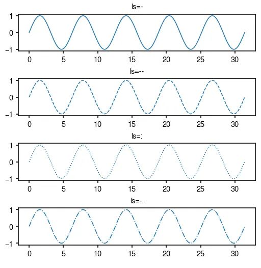
ls, linestyle: 선의 스타일을 결정한다. 종류는 -, --, :, -. 4개만 알아도 충분하다.
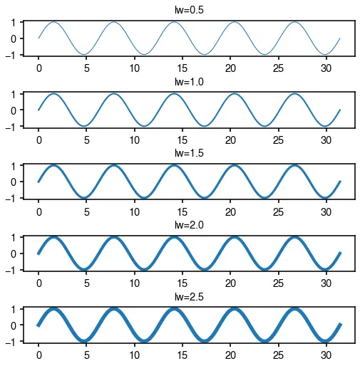
lw, linewidth: 선 굵기
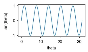
기본 ax.plot
fig = plt.figure(figsize=(2, 1))
ax = fig.add_subplot()
x = np.linspace(0, 10*np.pi, 1000)
ax.plot(x, np.sin(x))
ax.set_xlabel('theta')
ax.set_ylabel('sin(theta)')
Python
복사
선 스타일 ls
fig = plt.figure(figsize=(4, 1 * 4))
x = np.linspace(0, 10*np.pi, 1000)
for i, ls in enumerate(['-', '--', ':', '-.']):
ax = fig.add_subplot(4, 1, i+1)
ax.set_title(f'ls={ls}')
ax.plot(x, np.sin(x), ls=ls)
fig.subplots_adjust(hspace=0.75)
Python
복사
선 굵기 lw
fig = plt.figure(figsize=(4, 1 * 4))
x = np.linspace(0, 10*np.pi, 1000)
for i, lw in enumerate(np.arange(0.5, 3, 0.5)):
ax = fig.add_subplot(5, 1, i+1)
ax.set_title(f'lw={lw}')
ax.plot(x, np.sin(x), lw=lw)
fig.subplots_adjust(hspace=1)
Python
복사
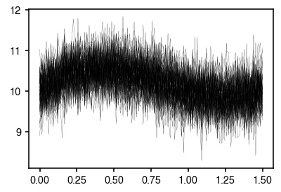
여러 line들의 분포를 나타내려면 seaborn.lineplot
종종 x 변화에 따른 y 변화의 경향을 보는 실험을 많이 반복하여 그 결과를 나타내야 할 경우가 있다. 이 때, 수많은 line들을 한 plot에 그려야 하는데, 보통 정신없고 깔끔하지 않은 경우가 많다. 아래의 그림이 그 예이다.
fig = plt.figure(figsize=(3, 2))
ax = fig.add_subplot(111)
x = np.linspace(0, 1.5, 100)
for _ in range(100):
ax.plot(
x,
2*x**3-5*x**2+3*x+10 + np.random.normal(scale=0.4, size=x.shape),
c='k',
lw=0.1
)
Python
복사
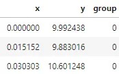
이 경우에는 line들의 분포를 나타내는 그림을 그려보는 것도 좋다. 이를 위해서 seaborn의 도움을 받아서 그리면 편한데, 데이터를 dataframe 형태로 구성하기만 하면 된다. 이때 각 선이 속하는 group에 대한 정보가 필요하다. 여기서는 group이라는 컬럼에 그 정보를 담아두었다.
import pandas as pd
from collections import defaultdict
data = defaultdict(list)
x = np.linspace(0, 1.5, 100)
for group in range(100):
data['x'].extend(list(x))
data['y'].extend(list(2*x**3-5*x**2+3*x+10 + np.random.normal(scale=0.4, size=x.shape)))
data['group'].extend([group] * 100)
data = pd.DataFrame(data)
data.head(3)
Python
복사
이제 sns.lineplot을 써 보자.
fig = plt.figure(figsize=(3, 2))
ax = fig.add_subplot(111)
sns.lineplot(data=data, x='x', y='y', ax=ax)
Python
복사
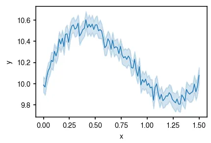
위의 그림보다 훨씬 깔끔한 형태로 line들의 분포가 나타내어진 것을 알 수 있다.
가운데 실선은 평균 값을 나타내며, 주변의 error band는 기본적으로 95% confidence interval을 나타낸다.
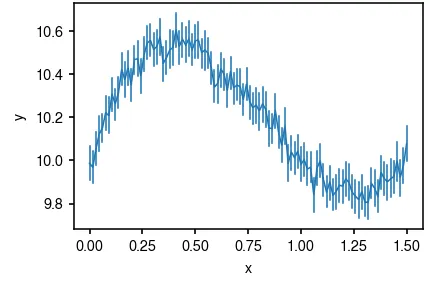
Confidence interval을 그리는 방법을 변경하자 err_style
Confidence interval은 기본적으로 err_style='band'로 설정되어 있다. 다른 선택지는 err_style='bars'이다. 아래와 같이 그려진다.
fig = plt.figure(figsize=(3, 2))
ax = fig.add_subplot(111)
sns.lineplot(data=data, x='x', y='y', err_style='bars', ax=ax)
Python
복사
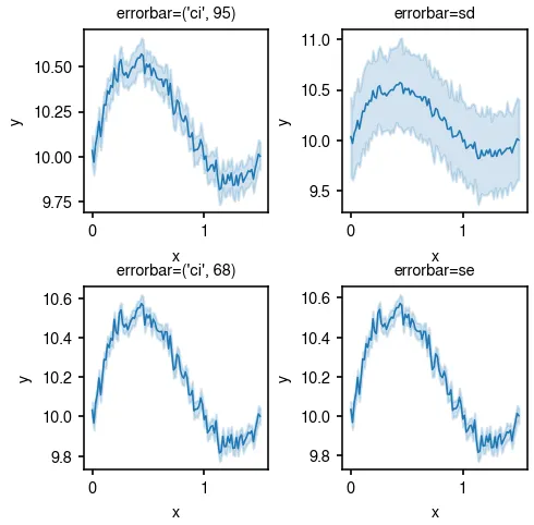
Confidence interval 범위를 설정하자 errorbar
기본값으로 confidence interval은 95% confidence interval로 그려지도록 설정되어 있다. 이를 변경하고 싶다면, errorbar 파라미터를 사용하면 된다. 기본값은 errorbar=('ci', 95) 이며, errorbar='sd', errorbar='se' 등으로 standard deviation, standard error는 쉽게 설정이 가능하다.
fig = plt.figure(figsize=(3.5, 3.5))
errorbars = [('ci', 95), 'sd', ('ci', 68), 'se']
for i, errorbar in enumerate(errorbars):
ax = fig.add_subplot(2, 2, i+1)
ax.set_title(f'errorbar={errorbar}')
sns.lineplot(data=data, x='x', y='y', errorbar=errorbar, ax=ax)
Python
복사
Confidence interval에 관해서는 아래를 한번 읽어보면 좋다.
•
68-95-99.7 rule https://en.wikipedia.org/wiki/68–95–99.7_rule