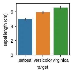
범주 별 변수 값의 분포를 확인하거나, 평균값을 비교하고 싶을 때 가장 쉽게 사용할 수 있는 plot. Seaborn barplot의 경우 error bar 설정에 항상 유의하자. Default는 95% CI이다.
Seaborn barplot 기본
fig = plt.figure()
ax = fig.add_subplot(111)
sns.barplot(data=iris, x='target', y='sepal length (cm)')
Python
복사
Error bar에 대하여
Seaborn barplot 기본 error bar는 95% confidence interval을 나타낸다. (즉, (standard error) 범위를 나타낸다.) 보통 범위로 error bar를 표시하는 편이 보기에 더 좋을 때가 있는데 (error bar가 더 짧아서), 이 때는 ci=68 을 주면 된다. 아래 참고.
), 이 때는 ci=68 을 주면 된다. 아래 참고.•
68-95-99.7 rule https://en.wikipedia.org/wiki/68–95–99.7_rule
fig = plt.figure()
ax = fig.add_subplot(111)
sns.barplot(data=iris, x='target', y='sepal length (cm)', ci=68)
Python
복사
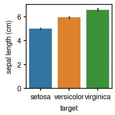
+-SE 를 나타내는 error bar는 더 짧다.
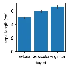
Bar 색깔 통일 fc
fig = plt.figure()
ax = fig.add_subplot(111)
sns.barplot(data=iris, x='target', y='sepal length (cm)', fc='C0')
Python
복사
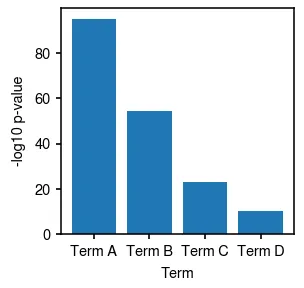
Pyplot barplot 기본
예를 들어서 functional enrichment 결과를 barplot으로 보여준다고 하면 아래와 같다.
fig = plt.figure(figsize=(2, 2))
ax = fig.add_subplot(111)
ax.bar(data.Term, data.log10_pvalue)
ax.set_xlabel('Term')
ax.set_ylabel('-log10 p-value')
Python
복사
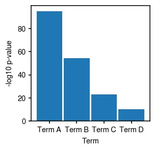
Bar를 더 두껍게
fig = plt.figure(figsize=(2, 2))
ax = fig.add_subplot(111)
ax.bar(data.Term, data.log10_pvalue, width=0.95) # width를 0~1 사이로 조절
ax.set_xlabel('Term')
ax.set_ylabel('-log10 p-value')
Python
복사
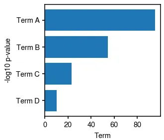
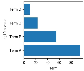
가로 barplot barh
보통 functional enrichment의 경우는 term 이름이 길어서 가로로 보여주는 경우가 많다.
fig = plt.figure(figsize=(2, 2))
ax = fig.add_subplot(111)
ax.barh(data.Term, data.log10_pvalue) # barh
ax.set_xlabel('Term')
ax.set_ylabel('-log10 p-value')
Python
복사
y-axis를 뒤집기 ax.invert_yaxis()
fig = plt.figure(figsize=(2, 2))
ax = fig.add_subplot(111)
ax.barh(data.Term, data.log10_pvalue)
ax.set_xlabel('Term')
ax.set_ylabel('-log10 p-value')
ax.invert_yaxis()
Python
복사